All about the color theory.
Table of content:
- The color theory.
- What are complementary colors?
- What creates red and green?
- What are analogue colors?
- What are Triadic Colors?
- The color-itself-contrast.
- What shades are there?
- The theory of colors effect.
- What are color families?
- How are colors created:
- Are black and white colors?
- What are good color combinations?
- The color wheel by Johannes Itten:
- What is the color symbolism?
- Everything briefly and concisely summarized:
The color theory:
Color theory is a system used to classify colors. It consists of simple rules and is of great importance for every artist, graphic artist and designer. Fortunately, the theory is very simple and easy to learn.
Color theory deals with the color stimulus in the eye and brain, the laws of color mixing and the ordering of colors. In this article, however, we will not deal with the biological side, but only with the side relevant to the design.

What are complementary colors?
Complementary colors are supplementary colors and are particularly important in an attractive design. The following things stand out in particular:
- Each color has only one complementary color.
- Mixing two complementary colors creates a grey-black color.
- A color's complementary color is exactly opposite on the uniform color wheel.
Also interesting is the fact that all colors consist of three primary colors. These three primary colors are blue, green and red. Complementary colors are used in almost every design. They go well together and their contrasts are usually pleasing to the human eye.
A color wheel helps you quickly find the complementary color of a color. On the color wheel, you will always find the complementary color opposite your chosen color. You can use these for any of your images, designs or posters.
What creates red and green?
The combination of the colors red and green results in the color yellow. The realization that all our colors consist of only three basic colors is certainly new for many and also an interesting fact.
What are analogue colors?
Similar to the complementary colors, these can also be found on the color wheel again, but this time not exactly opposite but next to each other. A good example of this would be red and orange or green and yellow.
What are Triadic Colors?
You can also find these colors in the color wheel. Triadic colors are very bright and dynamic to the human eye. An example of this would be light blue, bright yellow and white.
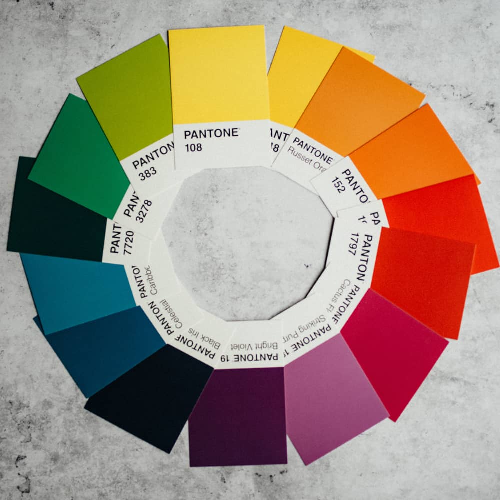
color-itself-contrast
A combination of at least two pure colors (e.g. red, blue and green) creates the color-in-itself contrast. This contrast increases the further apart the colors are on the color wheel. An example with a high contrast would be green, yellow and blue.
This effect is very often used in design, especially in web design, the color-in-itself contrast is used to draw the user's attention to certain surfaces, objects or functions.
The only disadvantage that arises when using this contrast is that the colors lined up next to each other usually do not look so visually appealing. This effect should only be used when it is really needed.
What shades are there?
The simple color wheel consists of 12 colors, three of these colors are the universally known colors; Red, Green and Blue. In addition to the three main colors, this color wheel also consists of three other secondary colors; Green, Orange, Purple. The remaining six colors are called tertiary, these are e.g.: light green, light blue etc..
Of course there are more than these 12 colors. That would be further mixtures, brightness and contrast gradations. But since, fortunately, there are infinitely different variations of colors, they unfortunately do not all fit into one color wheel. For this reason, only the "most important" colors are included in the color wheel.
Color codes in the rgba writing are mostly used for web development. This specifies red, green, and blue values for each color. The difference between rgb and rgba is that the opacity of the color is also specified for the rgba calculation whiteness. This computational whiteness allows you to create even more colors through overlays, transparency and different opaque effects.
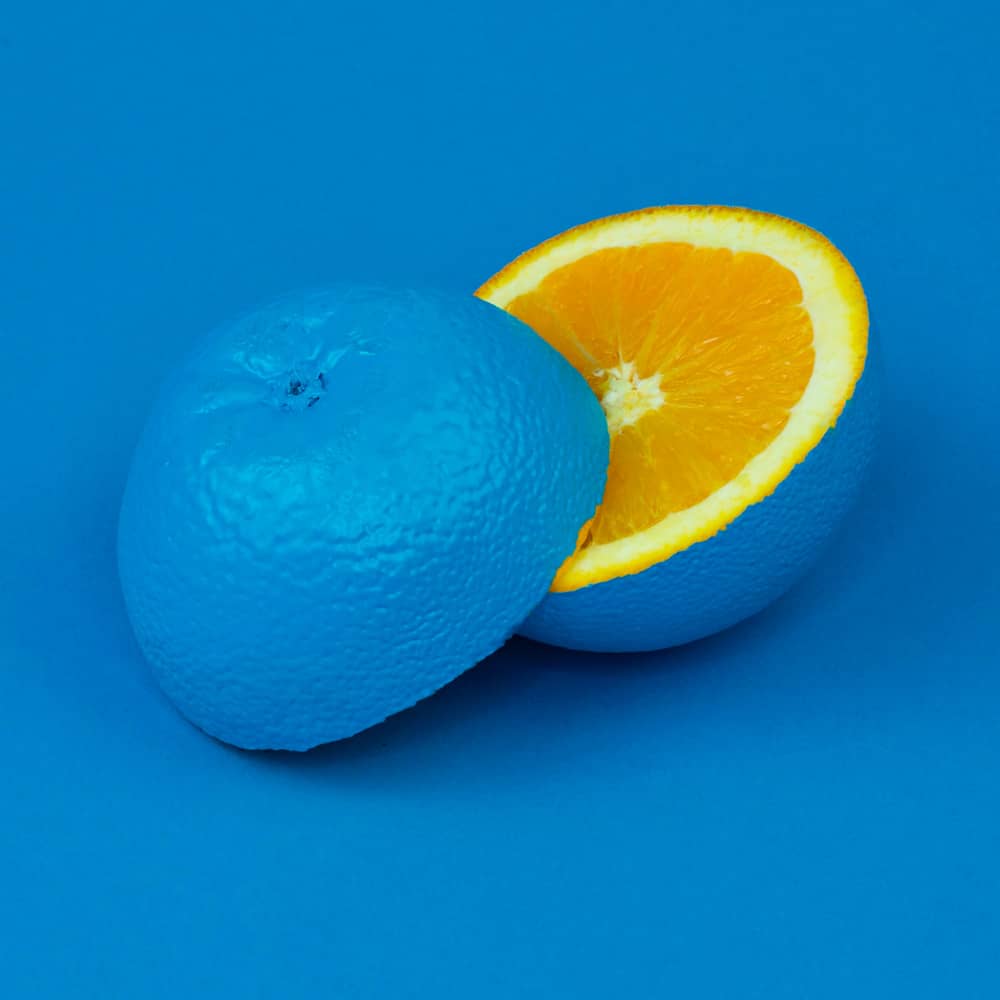
The theory of colors effect:
Each color triggers a different emotion in a person. These vary from person to person, but there are certain rules that, in most cases, apply to almost all of us.
It is particularly interesting that cold colors such as blue have a calming effect, they trigger trust. This is also a reason why many insurance companies, banks, companies and politicians consciously include the color blue in their websites, logos and clothing.
Warm colors like red, orange and yellow have a stimulating effect and make you lively. Depending on the brightness level, these can also make you tired. The lighter the more awake and the darker the more sleepy these colors make you.
Certain colors make rooms appear larger and help in spatial representation for better orientation or to create an illusion.
Now these were some examples of the effect of colors, but since each person varies, they change of course also the emotions triggered by colors..
What are color families?
Color families are all colors that start from a certain base color, these differ in appearance but are based on the same mixing colors. The differences are caused by brightness, contrast, or transparency (opacity). For example, there is light blue, blue, dark blue, midnight blue, etc. These do not necessarily have to look like blue and differ greatly.
However, an important point for web designers is that these colors can be combined well. Mixing them and building them into different aspects of a design or functions creates pleasant and appealing aspects of the design. Architects, graphic designers and copywriters often make use of color theory.
How are colors created?
Each color impression is subjective. Until now, it has still not been possible to prove whether each color is the same for everyone. In other words, blue does not have to be blue for everyone. A color stimulus is created by our visual system. This is where light waves hit our retina. However, there is still a long way to go from our retina to a real image.
The pictures taken are upside down (upside down) our brain changes them and we see the right way around again. The different colors are also measured on our retina and transmitted via the optic nerve to our brain for processing.
We perceive white light when too much light hits our retina at once. There is an unproven theory that suggests different color perception due to different eye colors. However, this has not yet been proven. Some animals are color blind and have no way of distinguishing colors except for their black and white contrasts.

Are black and white colors?
Noyes.You can recognize the "colors" black and white, but black is not a real color. Black means that this material reflects no light or very little light and your retina therefore receives no light.
In this sense, the “colour” white is more of a colour. It occurs when a material reflects each light wave and those light waves hit your retina.
As a layman, however, you can definitely call black and white colors because otherwise conversations can become unnecessarily complicated. In programs, colored pencils and felt-tip pens, the colors white and black are also spoken of.
What are good color combinations?
In order to find good color combinations for your website or your design, you can use the color wheel as a guide, but beautiful combinations do not always have to be in complementary colors. For this reason, we have therefore summarized the most beautiful and appealing color combinations for your website or your design.
- Pink and Dark Blue
- Red, Meerschaum and Violet
- Gelb, Magenta, Cyan und Schwarz:
- Senf und Schwarz:
- Magenta, Golrute, Türkis und Ziegelrot:
- Verschiedene Pinktöne und Braun:
- Gold, Kohlengrau und Grau:
- Marineblau, Mandel, Orange und Mango:
- Hellbraun, graues oder dunkles Türkis, und Schwarz:
- Marineblau, Ocker, Siena und Hellgrau:
Here are some combinations for your website or design:
Color codes for designers: #E5216 and #0D1137
Color codes for designers: #D72631, #A2D5C6 and #077B8A
Color codes fo designers: #E2D810, #D9138A, #12A4D9 und #322E2F
Color codes fo designers: #F3CA20 und #000000
Color codes fo designers: #CF1578, #E8D21D, #039FBE und #B20238
Color codes fo designers: #E75874, #BE1558, #FBCBC9 und #322514
Color codes fo designers: #EF9D10F, #3B4D61 und #6B7B8C
Color codes fo designers: #1E3D59, #F5F0E1, #FF6E40 und #FFC13B
Color codes fo designers: #ECC19C, #1E847F und #000000
Color codes fo designers: #26495C, #C4A35A, #C66B3D und #E5E5DC

Color wheel by Johannes Itten:
Johannes Itten was an artist and Swiss painter. He worked as a master teacher at the Bauhaus and developed the 12 colored color circle in addition to many other design-related things. The basis of which still has an essential influence on our design on the web and analogously today.
Without Johannes Itten, color theory would probably never have progressed as far as it is today. It thus played an important role in our current experience on the web.
What is the color symbolic?

As mentioned above, color symbolism or color symbolism deals with the symbolism of colors and motifs, as well as the properties of colors. Individual colors are particularly strongly associated with motifs and emotions. Human characteristics, feelings and elementary experiences can be conveyed using colors.
In order to make your website or your advertising poster particularly effective, you should also attach great importance to color theory and color symbolism in addition to web design and graphic design. This allows you to make your users into customers and consciously draw their attention to certain areas, objects, functions and things.
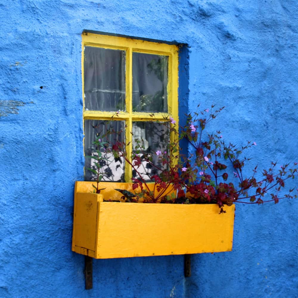
The color blue is particularly recommended for products, services or websites where you want to exude trust. Whereas dating portals make use of stimulating colors like red and orange. These warm colors have a stimulating effect and subconsciously let you linger longer on their portals.
Everything in a nutshell:
Color theory deals with the different colors. Thanks to her, there is a uniform system that helps you to find the right colors for your design.
The color wheel is probably the most well-known tool for finding the right colors for your design, poster or website. We have summarized the best color combination with the corresponding color codes for designers above.
There is an unlimited number of color tones, but the real main colors are described as a color spectrum of 12 fundamentally different colors. Each color consists of the three main colors red, blue and green (the RGB system takes advantage of this).
Color families are groups of colors that differ only in brightness, contrast and opacity, they are mixed using the same basic colors.
The color symbolism describes the emotions triggered by colors in us humans and how best to use them for self-interest. A good example of this is that blue is used for gaining trust.
Johannes Itten's color wheel is still used today, it includes the 12 most important or most common colors and still shapes color theory to a large extent.
